Developing a logo which is memorable and instantly recognisable is an important part of brand growth. Your logo is how you present yourself to the world and you want people to remember it!
For a bit of festive fun and to look back on the past year, the SRL team had a go at drawing some popular 2017 brand logos from memory. They could be drawn using any medium but the number one rule was that you couldn’t cheat and Google them.
So, we put pen to paper and the following illustrations show how memorable 2017 brands really were…
Netflix
This year saw some massive original series from Netflix including recent favourites Stranger Things 2 and the second season of The Crown. With a content budget of billions and Netflix being a major part of many people’s viewing habits, we thought we’d definitely remember what the logo looked like.
Netflix haven’t made things easy for us as after they rebranded in 2016 with a black background, they still keep the use of the white background and red text.
The official Netflix logo
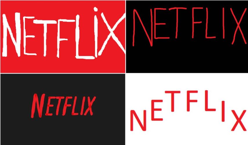
The Netflix logo drawn from SRL memory
Pepsi
In April, Pepsi launched what we will refer to as ‘perhaps not their most successful advertising campaign’. It did make us think about the brand though, so we had a go at drawing it. We all remembered that the colours were blue and white, and that the white sweep is from bottom left to upper right. We didn’t nail the shape exactly and we didn’t always get the blue and red the right way around – but you know what we meant!
![]()
The official Pepsi logo
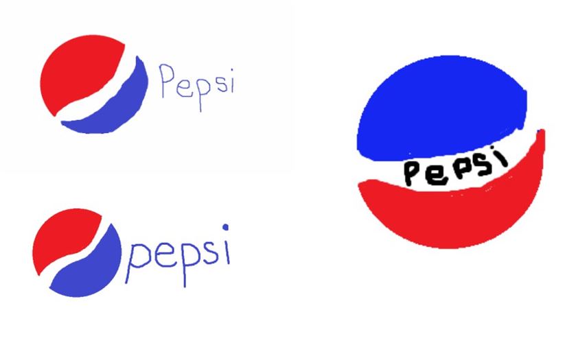
The Pepsi logo drawn from SRL memory
Ryanair
Again, Ryanair mightn’t have had the best 2017, so we saw quite a lot of this logo. We were quite good at remembering that the lettering was in upper case, but only one of us really nailed the harp. Colours seem to be what stick out in our memories most!
![]()
The official Ryanair logo
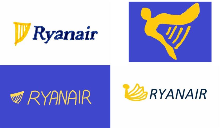
The Ryanair logo drawn from SRL memory
Bitcoin
Bitcoin have had an amazing year and hit the big time in January 2017. Although they are certainly the most well-known cryptocurrency out there we pretty conclusively proved that we don’t know what the logo looks like (other than it’s a yellowy-orange circle). Sorry bitcoin!
![]()
The official Bitcoin logo
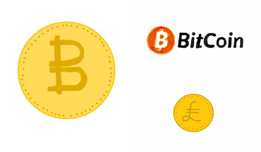
The Bitcoin logo drawn from SRL memory
Deliveroo
The gig economy and its pitfalls made headlines throughout this year and that’s why Deliveroo and Uber have both made our memorable logos line-up.
Thanks to Deliveroo our takeaway needs have been fulfilled and not with the Chinese down the road! Wagamamas, Pizza Express and GBK are all now within easy reach…
I think we did a pretty good job with Deliveroo to be honest (and that might say something about our takeaway habits). The design is quite simple and we managed to remember the vague idea of the stylised kangaroo.
![]()
The original Deliveroo logo
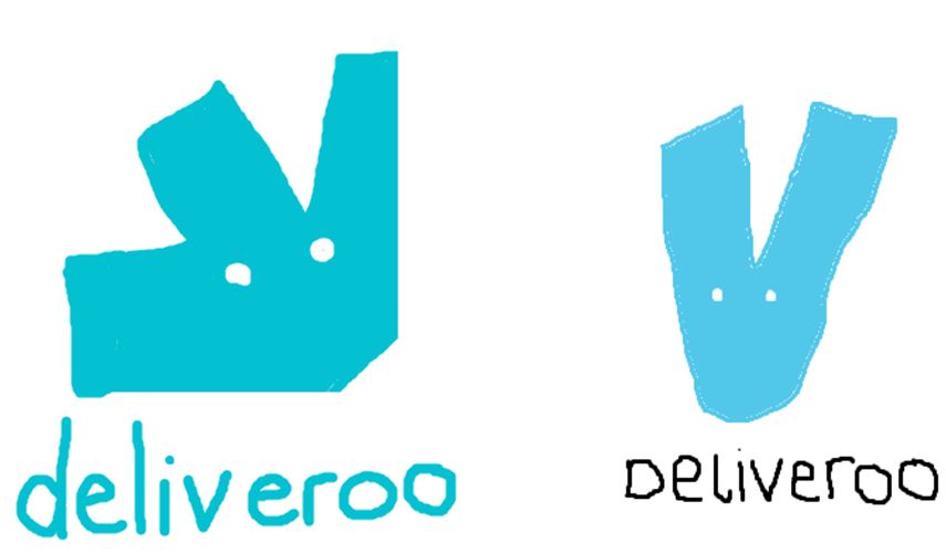
The Deliveroo logo drawn from SRL memory
Uber
2017 was the year London said no to Uber, and Londoners said ‘but how am I going to get home at 4am on a Sunday morning?!’. The brand name in white against the black background was clearly just what we needed after the complexity of the Ryanair logo.
![]()
The original Uber logo
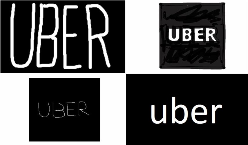
The Uber logo drawn from SRL memory


